Mar 2024-Aug 2024
Hudson Yards Kiosk
Improve the spatial navigation and wayfinding for 12 million mall visitors.

Platform
Role
Team
Myself, Product Designer, Product Manager, Engineering Lead, Senior Engineer, Engineer
Outcomes
Spatial orientation increased by 34%+
Brand visibility improved by 20%+
Context
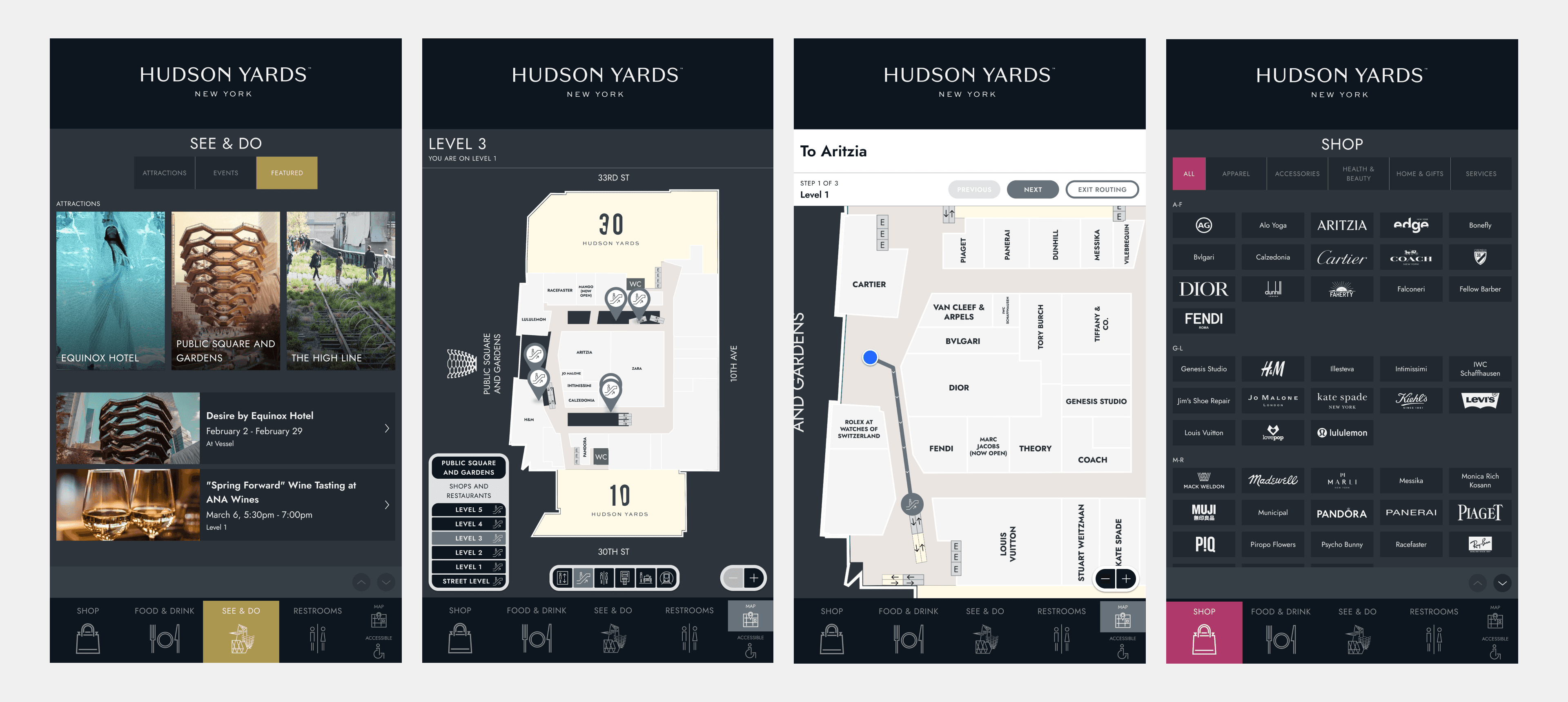
At Intersection, I led the UI design and spent 6 months with a team of 7 to redesign the B2C mall kiosks at Hudson Yards. Our goal was to improve the visitor navigation experience at the mall and identify pain points causing the directional issues. Part of my role entailed research, testing, designing for accessibility.
Improving spatial navigation by making maps user-friendly
Imagine walking into a massive, beautiful building with soaring ceilings and shining glass, only to feel completely lost within minutes. That’s what visitors were experiencing every day at Hudson Yards Mall. The space was visually impressive, but for many people, simply trying to find a store or a restaurant turned into a frustrating maze.
During my first visit to the mall, I observed something telling: visitors would approach the kiosk, tap around the map, then glance up at their surroundings with hesitation — as if none of the directions quite “matched” the physical world in front of them. Some would give up and walk in the wrong direction entirely.
The product team initially believed the main issue was the map instructions themselves. But I wanted to understand the problem from the visitor’s perspective — not just the kiosk’s.
Researching the Human Problem
I interviewed 15 mall visitors on-site and asked them to walk me through how they tried to navigate:
“Tell me where you’re headed and why.”
“What was the hardest part about figuring out where you were?”
“Has there ever been a time when navigation felt easy? What made it feel clear?”
Across the board — regardless of age, familiarity with the mall, or comfort with technology — the same frustration emerged:
People didn’t know how to orient themselves.
They couldn’t connect the map to the real environment around them.
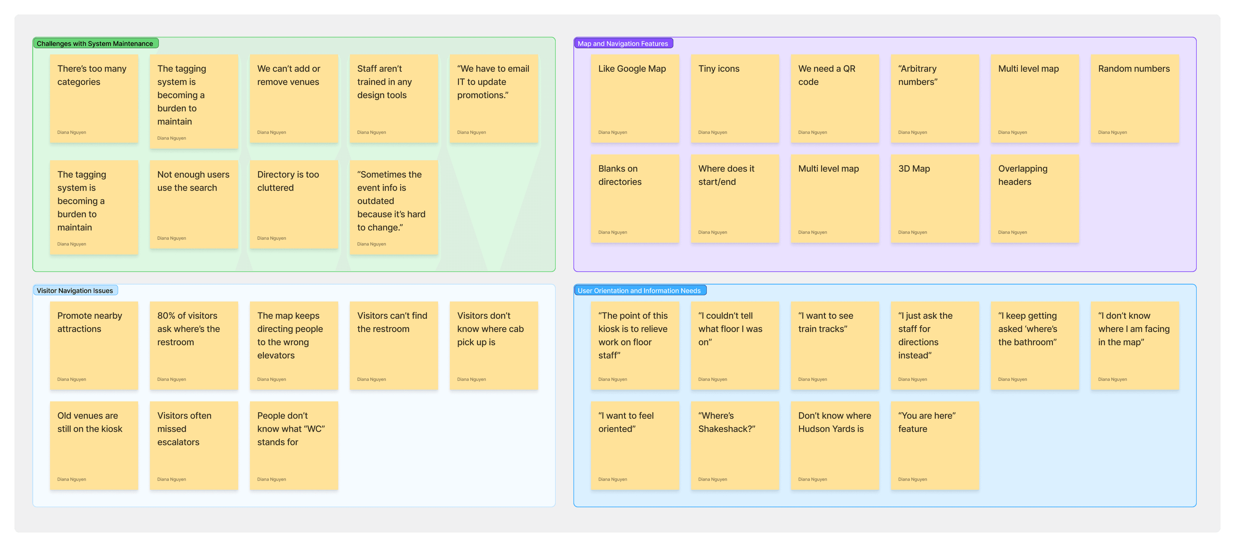
"I mean the map direction says walk 153 feet. That's sounds so arbitrary"
At the same time, stakeholder conversations revealed another issue: the kiosk directory was maintained manually and often contained outdated store information, which further weakened trust in the mall’s luxury brand image.
Key Insights
Insight | What It Meant for Users |
|---|---|
The 3D map looked impressive, but was hard to relate to real space | Visitors couldn’t mentally “place” themselves in the mall |
The mall’s large scale made people feel lost even after finding a direction | They needed anchors, not just directions |
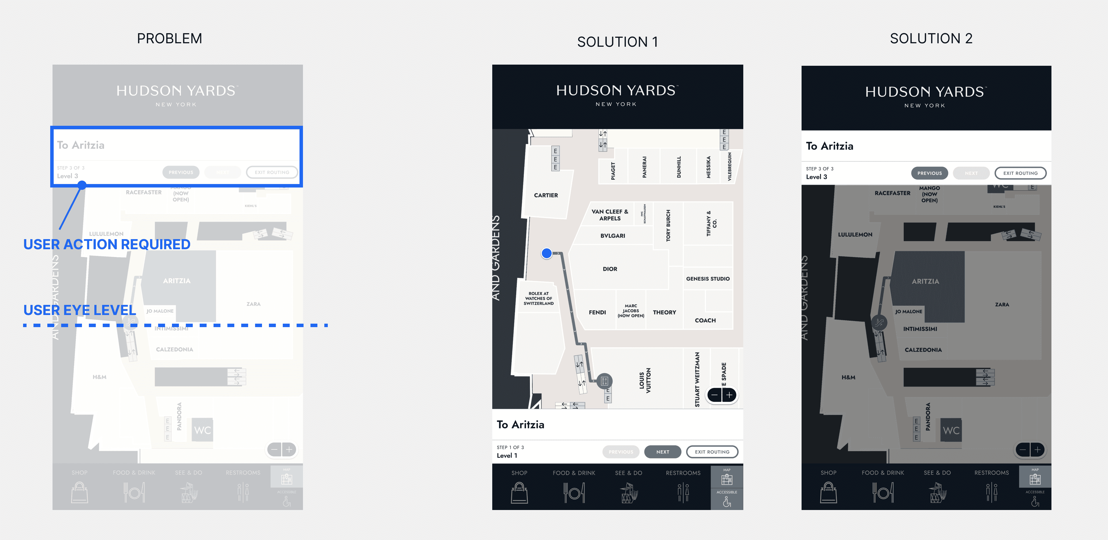
Step-by-step directions were not visually clear | People lost confidence mid-journey |
The directory was inaccurate and slow to update | It made the kiosk feel unreliable |
What visitors needed was not just directions — they needed orientation.
Designing for Real-World Grounding
I shifted the design approach from focusing on map detail to focusing on spatial clarity and confidence.
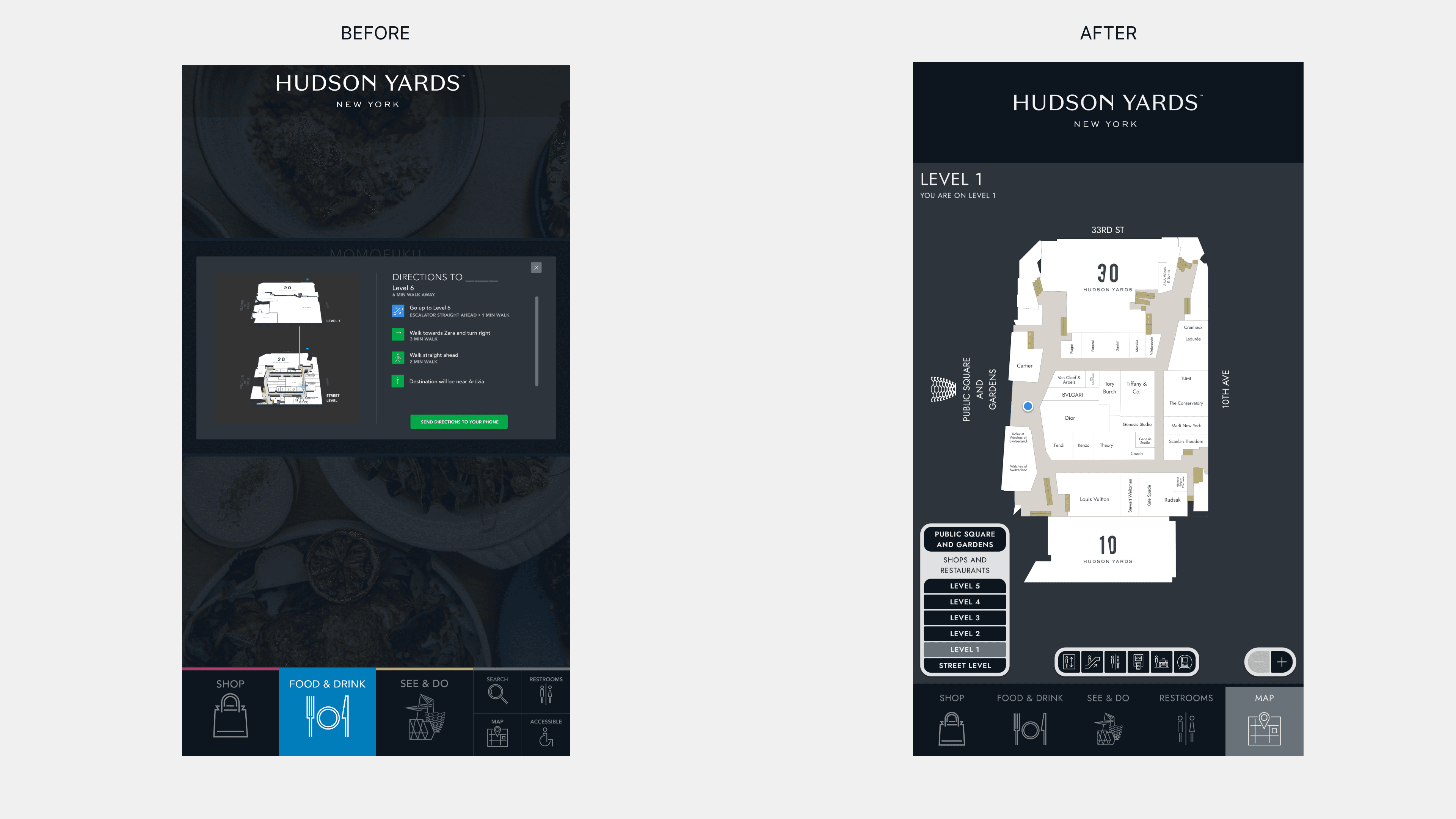
We redesigned the wayfinding experience to include:
A 2D map view that's easier to scan
Street and entrance labels that anchor visitors to their surroundings
A larger, clearer map display for visibility at a distance
Step-by-step previews that reduce cognitive load
I also designed two personas to ensure inclusivity:
A visiting tourist navigating the mall for the first time
A wheelchair user who needs clear paths to elevators instead of escalators
This shaped our user flows and ensured that every navigation path could adapt to the visitor's needs.
System + Visual Design
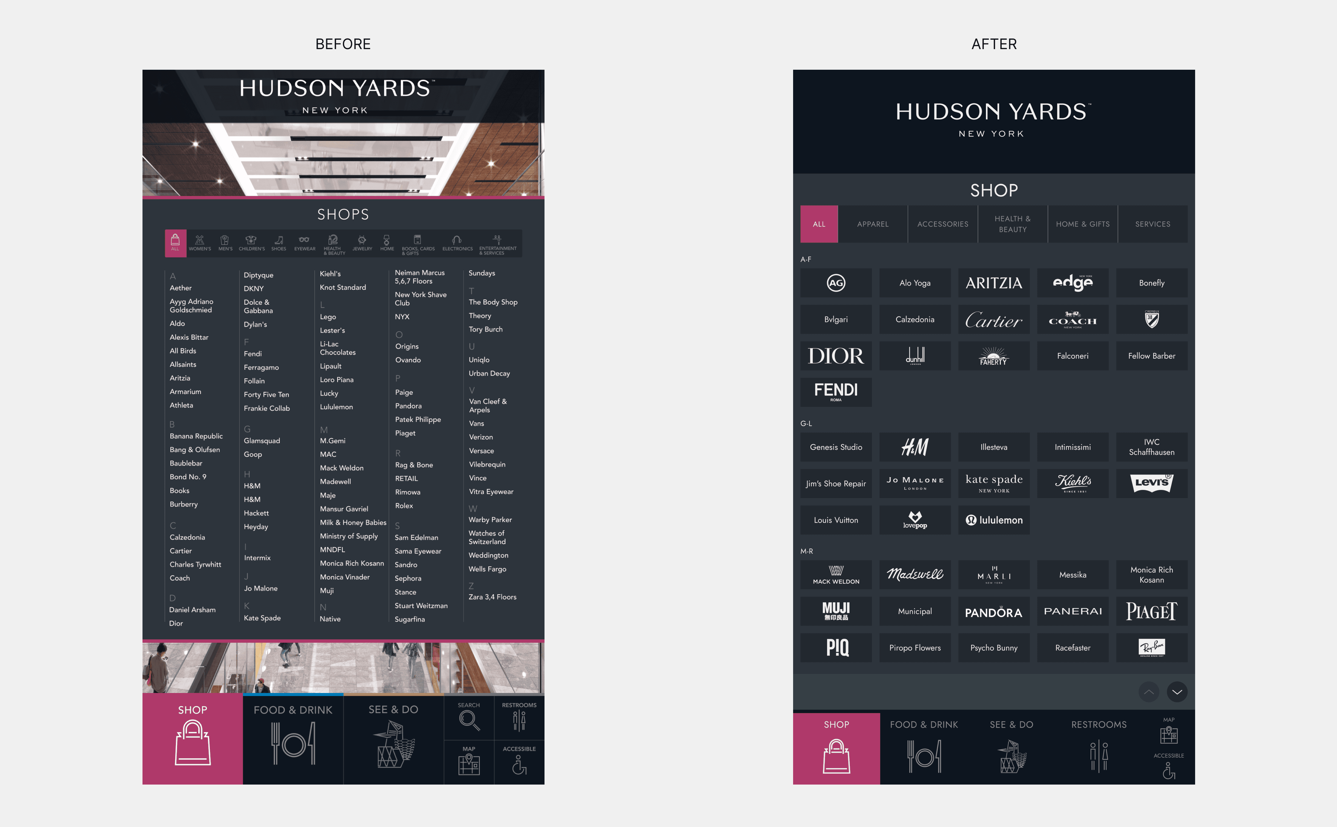
Because engineering constraints required us to use a pre-existing kiosk template, our early designs looked too similar to installations used in other malls — and the client disliked that.
To solve this, I built a custom design system — typography, spacing, iconography, touch target patterns — that could be applied quickly across screens. This allowed us to maintain:
A unique Hudson Yards visual identity
Fast iteration during client feedback cycles
A Critical Breakthrough From Testing
We tested 30+ builds:
First in the office
Then on-site inside Hudson Yards
Testing in the real mall environment was essential. When people tried using the kiosk while physically surrounded by the building, their reactions were authentic.
One user said something that changed everything:
“I need street names or something. I need to know where I am before I can follow the map.”
This insight directly led to emphasizing orientation first — not just navigation steps.
Outcomes
Result | Impact |
|---|---|
Spatial orientation increased by 34%+ | Visitors found their destinations more confidently |
Brand visibility improved by 20%+ | More stores were discovered and visited |
“It’s so much better. I can see everything now.” — VP of Related | Positive stakeholder reception |
Beyond Navigation: Analytics Dashboard
After improving the wayfinding experience, I also redesigned the kiosk analytics dashboard. I interviewed mall operators and business leads to understand what “useful” data looked like to them.
The dashboard now supports:
Daily monitoring of kiosk usage and foot traffic
Business insights on which stores receive the most attention
Technical maintenance visibility to prevent kiosk downtime
This helped the kiosk become not just a navigation tool, but a business intelligence tool.
Reflection
This project taught me how to bring structure into a client-driven environment where decisions were often made reactively. I became an advocate for process, clarity, and user perspective, ensuring that every design direction remained grounded in real human needs — not just stakeholder requests.
Most importantly, I helped transform a moment of frustration for visitors into one of confidence and ease.
RELATED PROJECTS

